
Project Introduction:
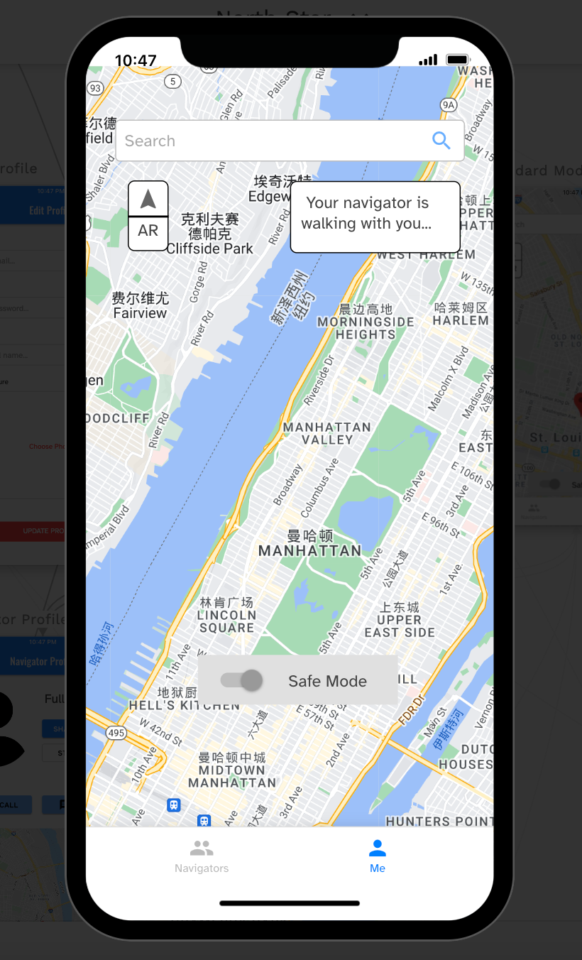
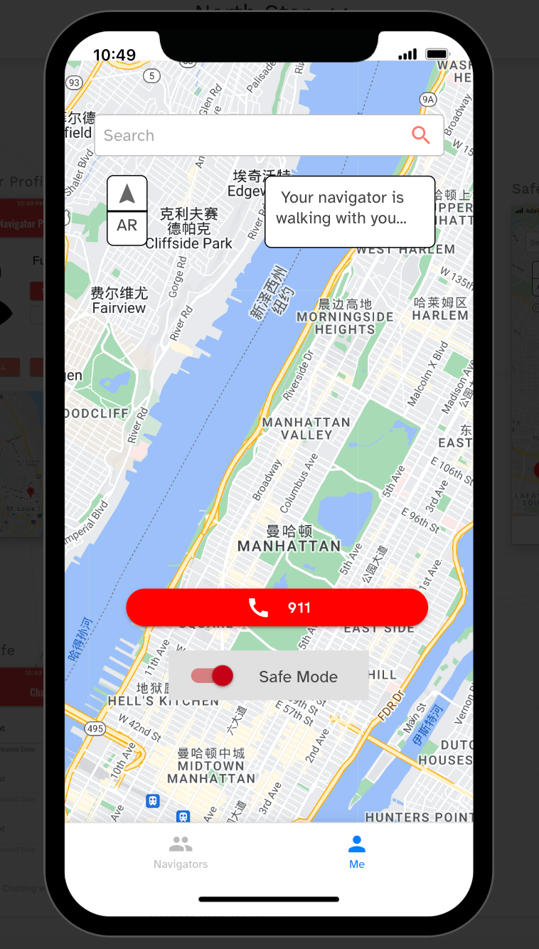
North Star is a map app which features its AR map, communication function, and safe mode. We implemented an AR map in this app to enhance the clarity of the guidance. But, to be honest, even with the most advanced map, we might get confused and lost. Because of that, when a user cannot find their way, they can match to a navigator (another user) to ask for help. We also considered about the safety of our users while walking in the late night, so we came up with the safe mode idea. The difference between standard mode and safe mode is that there is a big red button to call 911 in safe mode appearing on both the user's and the navigator's screens, but the standard mode does not have one. Due to the emergency call function, the theme color of the safe mode is red, and blue for standard mode.
Role: Progressive Web App Builder
Task: App designClient: People who need a clear map guidance/ hope to ask for someone's help while walking/ have a safety issue during the walk
Problem: No current map app has a communication function or has a safe mode.
Date & Duration: September 23 - 25, 2022
Concept: Safety is the priority of traveling.
Think about one late night that you walked on the street alone. Did you feel unsecured? Did you want someone to connect to you and help you to have emergency call when you are in danger? We hope the map app in your hand can help you out in this situation because feeling safe while walking is crucial for us to keep our normal life and explore more of things surrounding us.
Design Brief 1: Community Inclusion
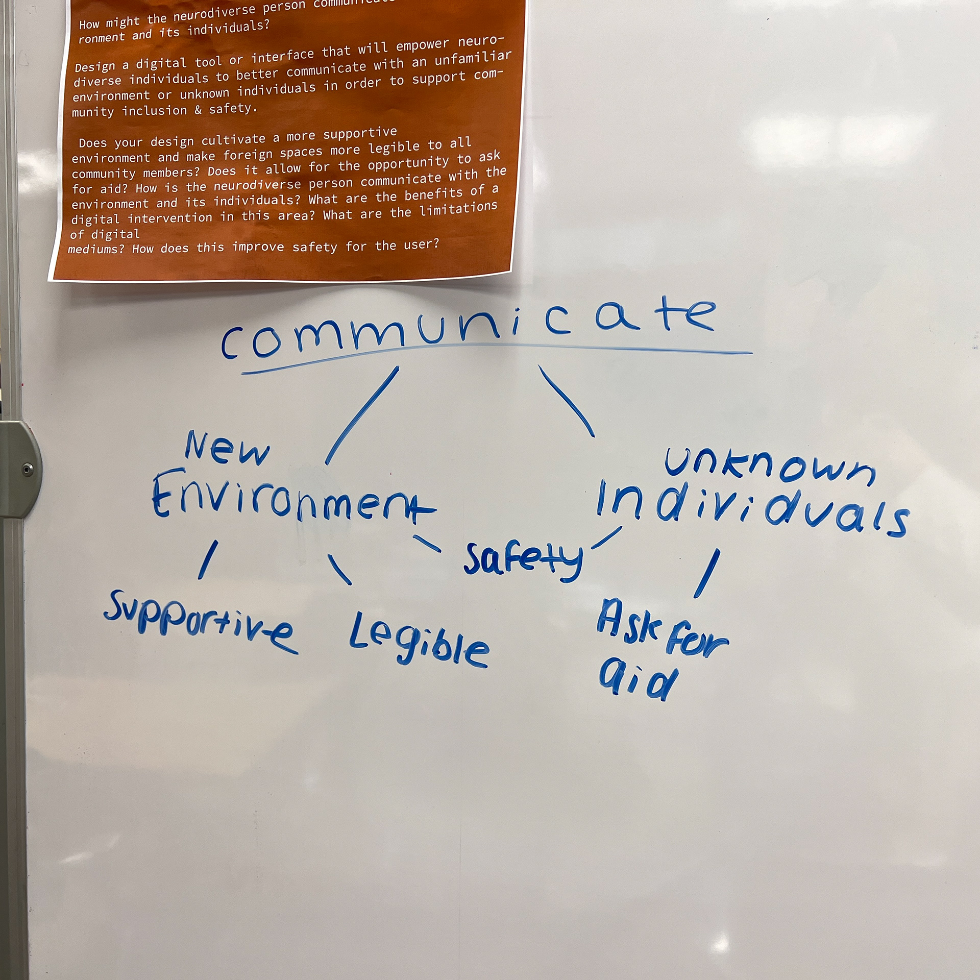
How might the neurodiverse person communicate with the environment and its individuals?
Design a digital tool or interface that will empower neurodiverse individuals to better communicate with an unfamiliar environment or unknown individuals in order to support community inclusion & safety.
Does your design cultivate a more supportive environment and make foreign spaces more legible to all community members? Does it allow for the opportunity to ask for aid?
What are the benefits of a digital intervention in this area? What are the limitations of digital mediums? How does this improve safety for the user?
Our Hypothesis
1. Anyone can be uncomfortable in an unfamiliar environment, but it can be especially difficult for neurodivergent people.
2. A sense of community could alleviate that discomfort.
3. Text-to-speech (TTS) critical to read navigation instructions, building information, and signage
Our Interviews with InclusiveU
Vinny: 19-year-old from Philadelphia, studying music at Syracuse University
1. Prefers text-to-speech for directions
2. Carries a personal alarm in case of emergency
3. Got lost in freshman year
Troy: 22-year-old from New York City, studying fashion design at Syracuse University
1. Parents do not permit him to walk alone at night
Kyle: A.K.A. “the King of Syracuse,” a 21-year-old from Long Island, studying history at Syracuse University
1. Peer Trainer for other Inclusive U students
2. Enjoys helping others navigate
All students agreed:
1. Was nervous traveling around SU until they got used to it
2. Prefers traveling with others, especially friends from InclusiveU
3. Rarely travel off-campus
Key Insight
1. The problem usually happens when traveling in an unfamiliar environment
2. We need to provide a way for users to have opportunities of making friends
3. Take neurodiverse people as the main consideration when designing the overall theme of app
4. Safety considerations for the range of people who can use the app
Our Solution: North Star
Northstar helps users navigate in a new space with the consideration of safety issues and accessibility for neurodiverse people.
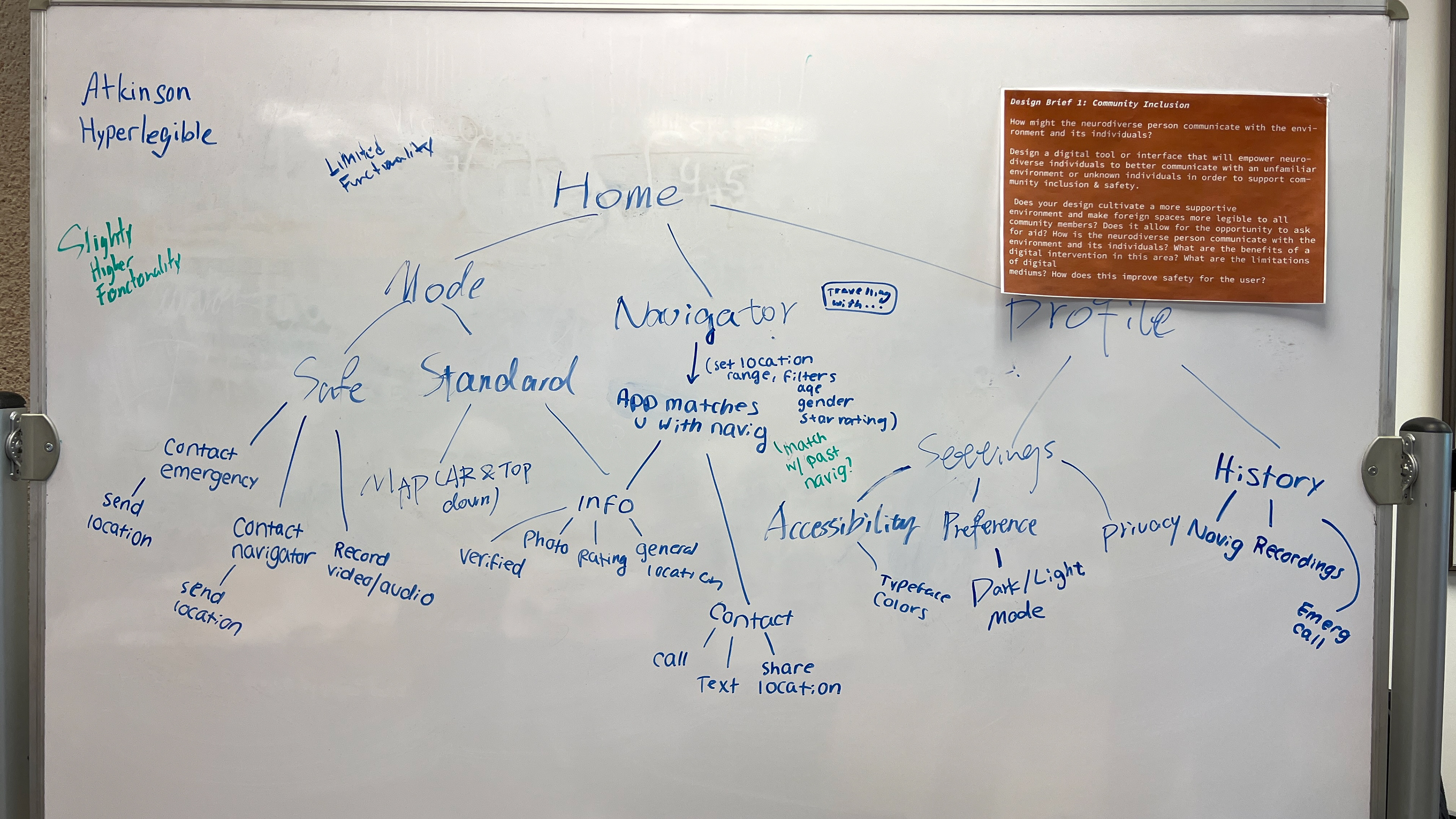
Information architecture: We discussed and arranged our main functions and pages based on the key insights from interviews with InclusiveU students.
Feature 1: Safe Mode
Main feature includes emergency calling function as well as navigator’s status. Users will be able to record videos when walking with navigators and report any suspicious activities.
(Brainstormed by team, implemented in Adalo by me)
Feature 2: Connect to a Navigator
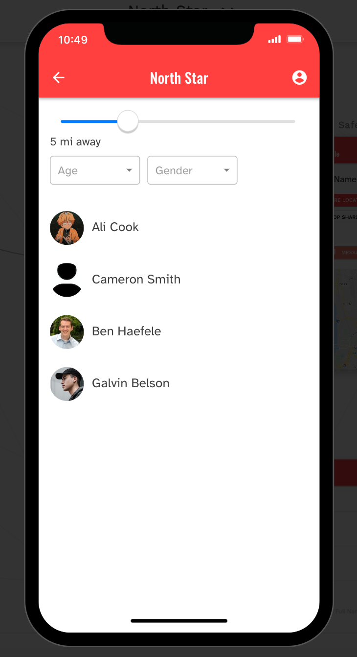
Main feature that gives the user a chance to get help from authenticated people nearby. Users will be able to filter the navigators’ age, gender, and location ranges based on their needs.
(Brainstormed by team, implemented in Adalo by me)
Feature 3: AR Map
Interactive first-person navigation for easier traveling.
(Brainstormed by team, implemented in Adalo by me)
Other Variance
Reflection
The difficulties: No one in our team had experience in using no-code design tools. I volunteered to implement the low-fi wireframes on Figma into the no-code design tool. I tried to work on Bravo and then switched to Adalo which is more friendly for a no-code beginner. I encountered a lot of bugs, but fixed all of them with my coaches help.
Main takeaway: When starting to learn a new tool, I should try to start with the easier one. After I learn the logic behind the easier one, I will have the ability to figure out the more complex but more powerful one. Also, I realized that functions should be prior to the actual UI design when building an app in a no-code design tool, especially for the beginner like me.
What I would do differently: If I had a chance to redo the whole project with my team, I would rather spend more time to discuss the functions we need than discussing the UI details. How detailed the UI would be should be based on what no-code design tool we choose to use and how complex UI the tool can make.
Good News
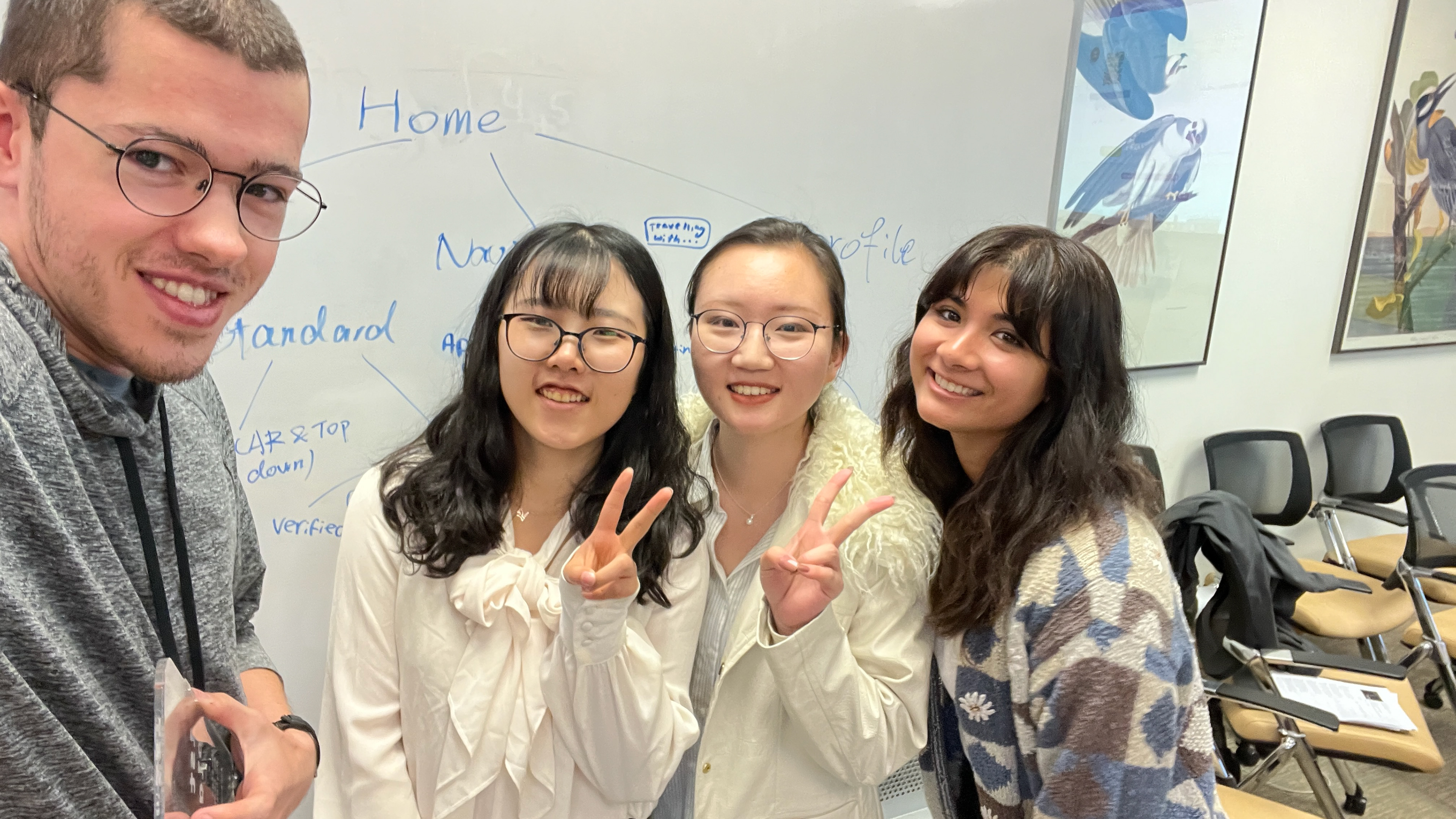
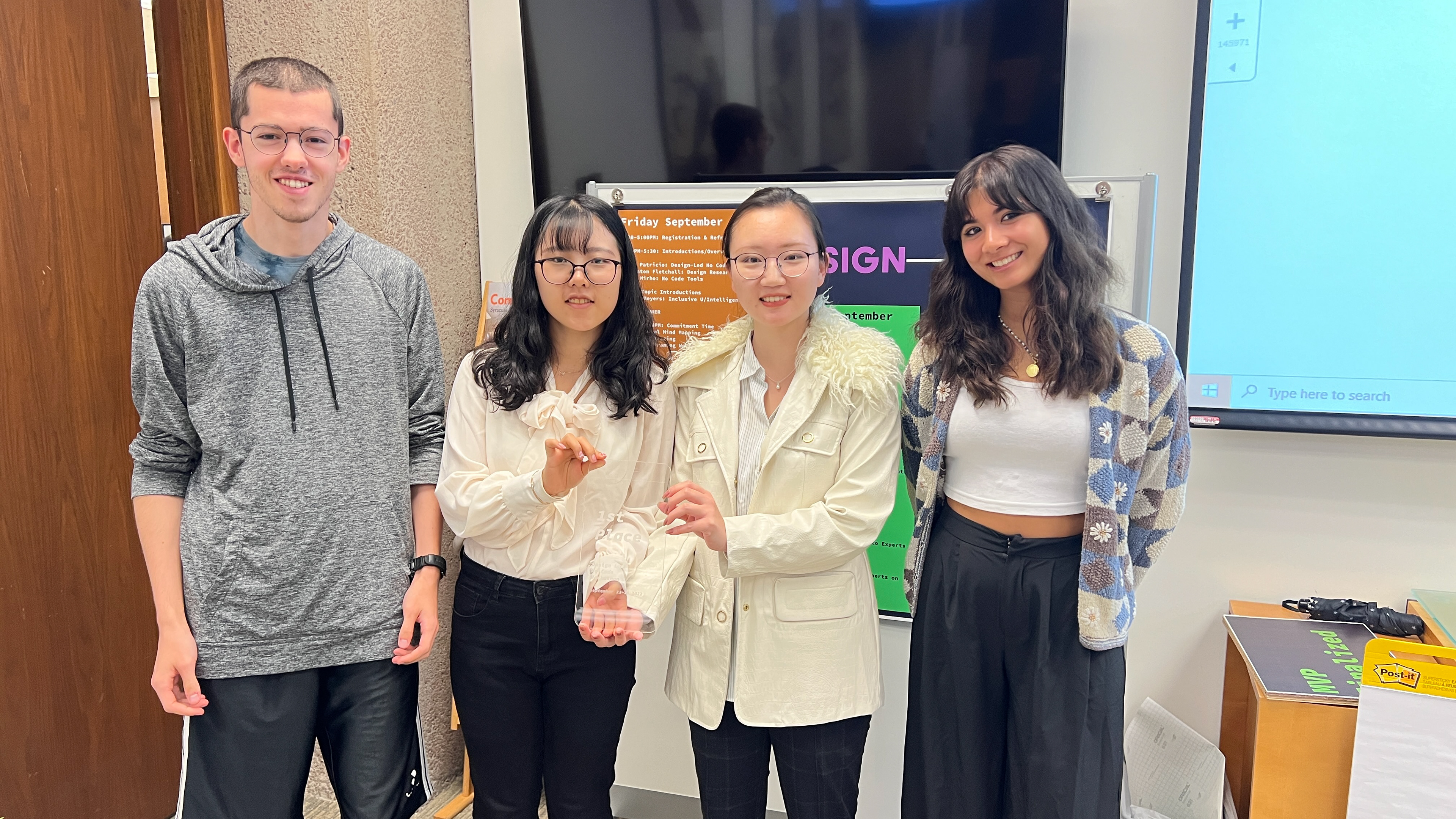
We won the 1st place!
Tools:
Figma
Adalo
